
Tooltester is supported by readers like yourself. We may earn an affiliate commission when you purchase through our links, which enables us to offer our research for free.
Do you remember the last time when you were on a website, you wanted to buy something or hire someone, but you just didn’t know exactly how to do it. Sure, there was a phone number and a contact form, but somehow the process was more difficult that it should have been.
Probably there was no clear call to action!
Call to actions can make websites much more efficient by giving visitors a path to accomplishing their objectives, making things easy and convenient right from the start.
In this article, we will look at the call to action in detail: what it is, why you need one (even if you are a solo freelancer!) and how you can easily implement a call to action on your website.
What Is a Call to Action?
A call to action is a clear direction that encourages the visitor to take a certain action. The most common example is a call to action button, a design element that is used on most corporate websites.
Every day, you are probably prompted to do something by a call to action, even if you have never come across the term before.
For example, here is the call to action on the KISSMetrics website.

The call to action is the blue button: Log in with Google.
Here’s the Dropbox homepage.
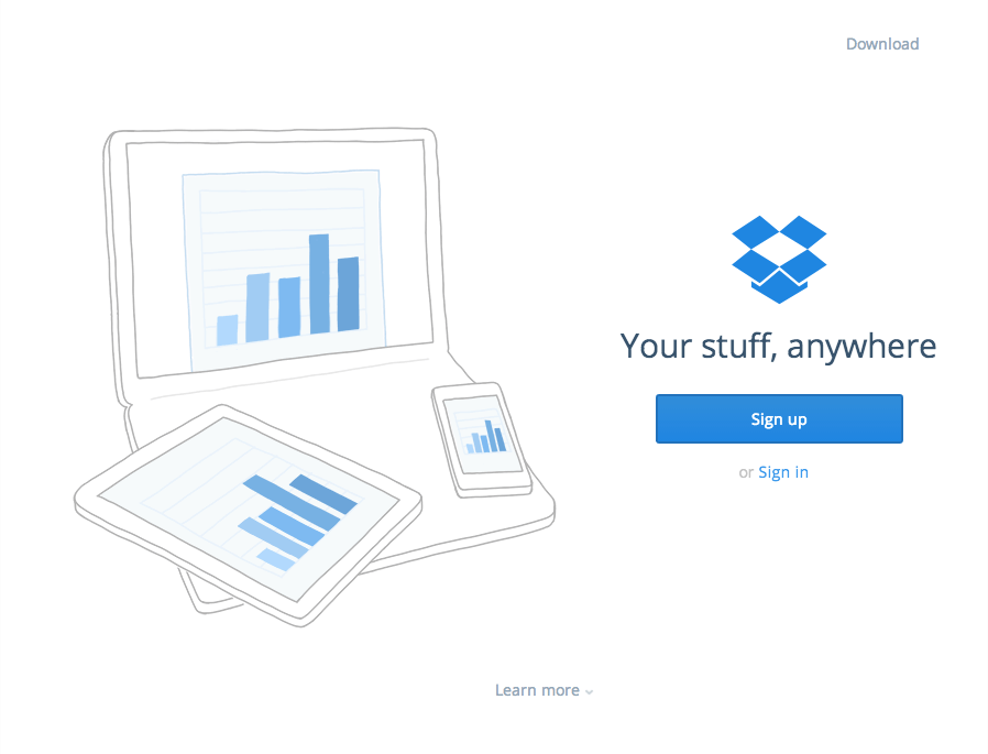
The call to action here is Sign up, in the blue box.
Call to action buttons are very effective on minimal page designs, but they’re also equally effective on more cluttered pages. Here’s the website for US web hosting company Hostgator:
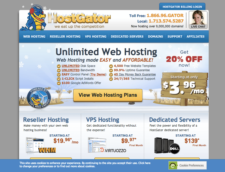
Despite the amount of text, the call to action button – View Web Hosting Plans – is easy to pick out, and it’s emphasized with a drop shadow too.
There is only one thing that could be optimized in all three examples: the CTA uses the same colour as other elements on the website – it’s better to use a unique colour that stands out even more.
Why Use the Call to Action?
On all three examples, you’ll probably have made the connection between the call to action buttons. Each one encourages the visitor to do something: sign up, log in or view plans.
The call to action is a way to direct focus and give the visitor a clear route to accomplishing a goal. When developing call to action buttons, consider what you want the visitor to do: what your primary aim is, and how this fits in with their objectives. It might be to log them in, sign them up, complete a sale, ask them to contact you or join a mailing list. Whatever it is, you will probably want to drive a sale in some way.
Keep in mind: a call to action is not only essential for big web companies. The same holds true for freelance websites.
While it’s probably obvious to you what they are supposed to do (call or email you), they might be unsure. Put yourself into the visitor’s shoes: would you rather search for the contact form, or click a button that says ‘Arrange Your Free Consultation’?
Example: Iceberg Webdesign

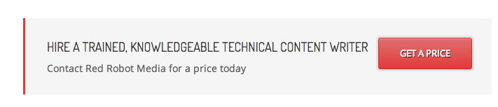
Or take a look at Red Robot Media, a copywriting agency:
Color Theory: Why it Matters
The color of your call to action button really matters; it’s rooted in color psychology. Testing has revealed that green and orange buttons work well, but on some sites, purple outperforms both. Many corporate websites are blue, and orange is the opposite color, which may explain why orange works so well.
Green is the color of good luck and generosity, making it the ideal color choice if you’re trying to get someone to make a positive step.
As well as choosing the color for your call to action, make sure that the colors are consistent across the board. Consistency helps to anchor the visitor’s eye and establish a meaning for your call to action. It’s OK to use the call to action more than once on a page providing they are the same color. (You may want to repeat your call to action above and below the fold, for example, so the user always sees one on-screen).
Completing the Call
Once you have the visitor’s attention, you must complete the process and give them the information you need. Don’t stop once the button has been placed. Ensure the destination behind the button is usable, well designed and gives the visitor exactly what they were promised.
If your call to action leads to a form, try to reduce the number of fields to the absolute minimum. Otherwise you’ll almost certainly lose your visitor’s interest, and all of your work on the call to action will have been wasted.
Create Your Button now – It’s Easy & Free
Not sure how to make a call to action button? It’s simple: just use an online generator.
If you are using a website builder such as Weebly, Wix and Yola, you can generate your buttons easily within the tool. Check out our comparison table if you want to learn more about our top-rated website builders.
If you have any questions, please leave a comment!
The author
Learn more about us
THE BEHIND THE SCENES OF THIS BLOG
This article has been written and researched following a precise methodology.
Our methodology